Artists and designers: 5 tips for professional printing
Posted in News, Perfect print design, Printing Tips and Tricks on 05 May 2021
Artists, illustrators, makers, designers… we know you want professional printing that looks fantastic.
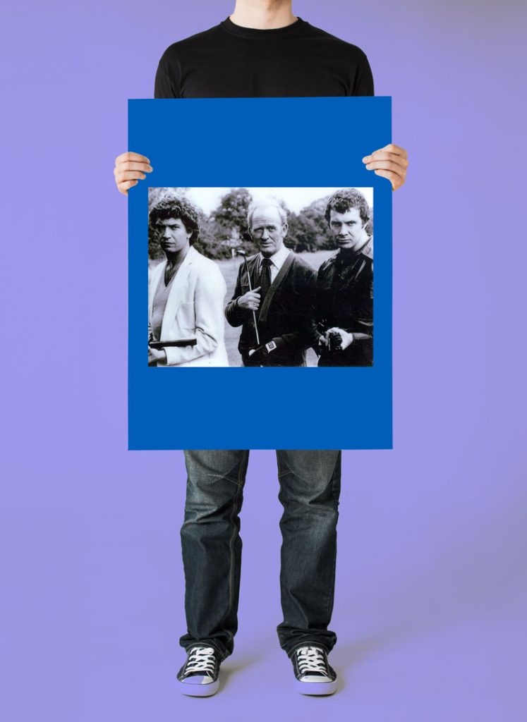
We thought it was about time to let the professionals know how to get the best out of Doxdirect. And we’re not talking about The Professionals from the cult British crime-action television drama series of the 80s. (What do you mean you’re too young to remember them?!).
We’re talking about the sort of professional who sells prints, posters, booklets and printed paraphernalia to your very happy customers via Dox. Here are some tips to help us give you the high quality print you expect.
1. File size too low
The most important thing is that any bitmap artwork should be a minimum of 300dpi. If you’re not sure how to find out the dpi (dots per inch) then a good indicator is to look at the file size. A properly created CMYK bitmap at 300dpi for A4 reproduction is approximately 40mb, so if it’s showing figures in the kilobytes rather than megabites, it’s a problem. You may well know this already, but believe it or not we do get files that are only 280kb and they can be so pixellated that they look like blurred out numberplates on crimewatch. We found a handy guide about file sizes here.
2. File size too high
At the other end of the scale is the file size that is far too big. Try to make sure your files are quick to upload by keeping the file size low. We’d rather not have files in the gigabytes, it clogs up our servers and slows things down. See our handy infographic about poster sizes on our previous blog here.
3. Printing to the edge of the page
We know you don’t want white borders on your prints, or you’d have put them there right?
If you require edge to edge printing please ensure your file is a standard A size, so A6, A5, A4, A3, A2, A1, A0. Or it must be able to scale to an A size exactly. All the relevant images, colours etc. must be touching the edge of the page, our system then creates mirror bleed for you. We don’t need you to provide trims and bleed, our super duper printers are so accurate that it’s not required.
If your file is an odd size it will create white borders.
However please do consider where your text and images are – try not to put anything important close to the edge of the page. It doesn’t look great and we want to make sure your artwork looks as professional as it can be.
4. Colour
Artwork should be provided as CMYK files and not RGB, there are usually settings you can find in the programme you’re using or when you export to PDF which makes it really easy. Talking of PDFs, this is the type of file we love… see our blog post here to find out why it’s so good.
5. Settings
If you use inDesign to create your artwork you can download this PDF settings file to enable you to create PDFs that are perfect for us to use. Once you have downloaded the file, go to the File menu in InDesign and click on Adobe PDF presets > Define. Then click Load, navigate to the .joboptions file and click open. The preset should then be there next time you export to pdf in the Adobe PDF Preset menu at the top.
Download InDesign PDF Preset file.
We hope that you can use these suggestions to make sure your artwork looks the best it can be for your customers, and if you have any questions, don’t be afraid to get in touch!