Colour trends
Posted in News on 07 January 2021
In the year 2000, the Pantone Color Institute started announcing a Pantone Colour of the Year as a trendsetting concept for branding, marketing and creative society.
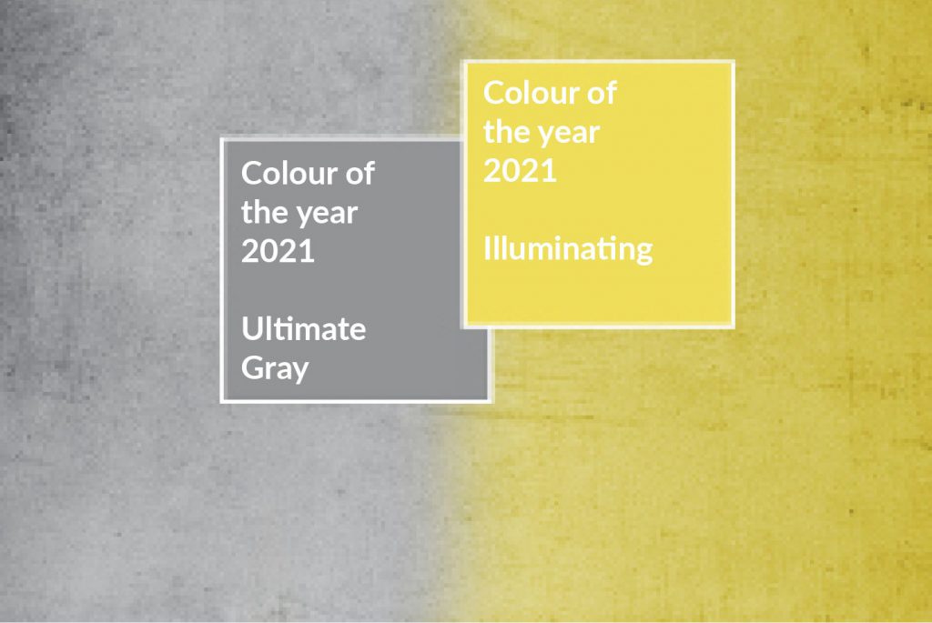 It has recently announced its two colours of 2021. It has called them ‘A marriage of colour conveying a message of strength and hopefulness that is both enduring and uplifting’. Adobe has hailed the colours as a new chapter, citing “The two colours — together — are a testament to the ways in which we have joined as friends, family, and neighbours to bolster our communities during the COVID-19 crisis. They stand to remind us of the importance of our relationships, support systems, and collective work. Both practical and rock solid, warming and optimistic, the combination of Ultimate Grey and Illuminating is one of resilience and hope — for our new year and beyond”.
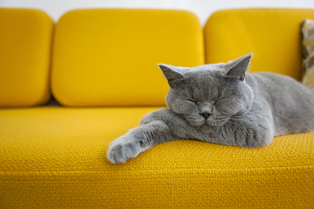
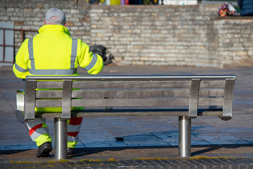 However, these two colours, grey and yellow, have sparked some controversy, being likened to hi-vis vests, road markings and hospital wards. It is the first time yellow has been picked in over a decade according to the Guardian. Vogue has called even called them ‘really weird (just like everything else this year)’.
 Here at Doxdirect, we always see plenty of blues, which always look good digitally printed. Cool colours in general; violets, blues, cool pinks and greens are always popular for books, stationery, invitations. And we often see more of these colours at this wintery time of the year too.
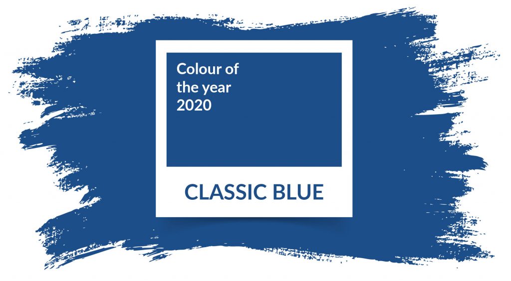
Pantone Colour of the Year 2020 was Classic Blue, described by Time Magazine as comforting and relatable. Laurie Pressman, Vice President of the Pantone Color Institute called it a reassuring blue, building connection. Little did they know what form of connection this would mean, with so many now working from home and having online meetings.
What colours are best for digital printing?
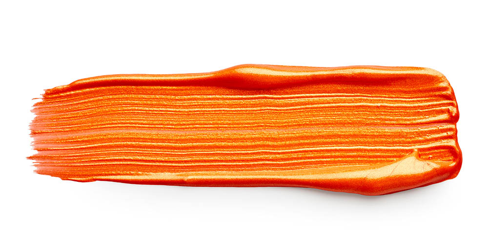 Our earlier blog post ‘What colour shall I use?‘ gives a bit of an insight into the psychology of colour, but what about the practicalities? Well, if blue is a joy to print, then the contrasting hue of orange could be said to be the opposite. Printing orange out of digital CMYK doesn’t give it the intensity of a spot colour.
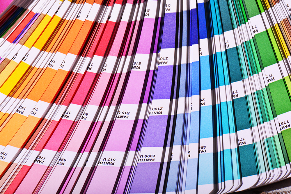
Another point to note is that if you have a large block of black and you want a really rich black colour, then don’t be tempted to give it 100% of CMYK. Use 30% cyan, 30% magenta, 30% yellow and 100% black. This will give great coverage but won’t oversaturate the paper.
Trending for the year ahead
Pantone Illuminating and Pantone Ultimate Gray (or the more usual spelling of ‘grey’ in the UK!) together will be one to watch over the coming year, in print and digital. After the calamity of 2020, the enduring message is one of hope, so perhaps Pantone have hit the nail on the head this time.