8 cover design tips for the perfect book cover
Posted in Perfect print design on 13 October 2020
When looking for a book to read, the first thing most people would do is check out the cover. Is it a serious book? Funny? Factual? Does the cover make you want to pick the book up and investigate the contents? Does the design immediately tell you what the book is about or what genre it is?
The cover is probably the last thing you think about – but it’s so important to have a great design that makes people want to pick up your book.
So how do you approach this if design is not your thing, and you don’t have the budget for a Graphic Designer?
Here are 8 cover design tips to help you come up with the perfect design.
1. Be inspired!
Look for inspiration from the internet, check out other book covers, decide what colours and styles you like. Pinterest is a great resource for this, you can do a search and see what’s out there. Then you can create your own board to gather a collection of images that you like, whether it’s a font, colour swatch, photograph or book cover.
We’re not talking about copying someone else’s cover, but you might see something that produces a spark in you and gives you an idea of your own.
If you don’t want to use Pinterest, why not create your own mood board with good old fashioned scissors and magazines!

2. What software do I use?
You can use any graphical program that allows you to insert and move text, images and apply colour. Some non-professional free online programs are good, such as Canva, which has templates to start you off.
Other options are PlaceIt, PosterMyWall and GIMP. If you are set on designing your own covers, these programs are great for the non-professional but they will only take you so far. Anyone can buy a licence for Adobe Indesign or Illustrator but they are professional programs and come with a steep learning curve.
If you don’t want to use any of these, or perhaps you’re just doing a one-off, you can use our simple Cover Design Tool – the perfect way to get the cover you want. You can change colours, add text and images, and you can read our blog about it here.

3. Sizing
Here at Doxdirect we print books in A5 and A4 sizes, so make the page size correct to start with and it will save any rejigging when it comes to printing. Although if your design isn’t in an A standard size, it will be resized to the requested A size, in proportion.
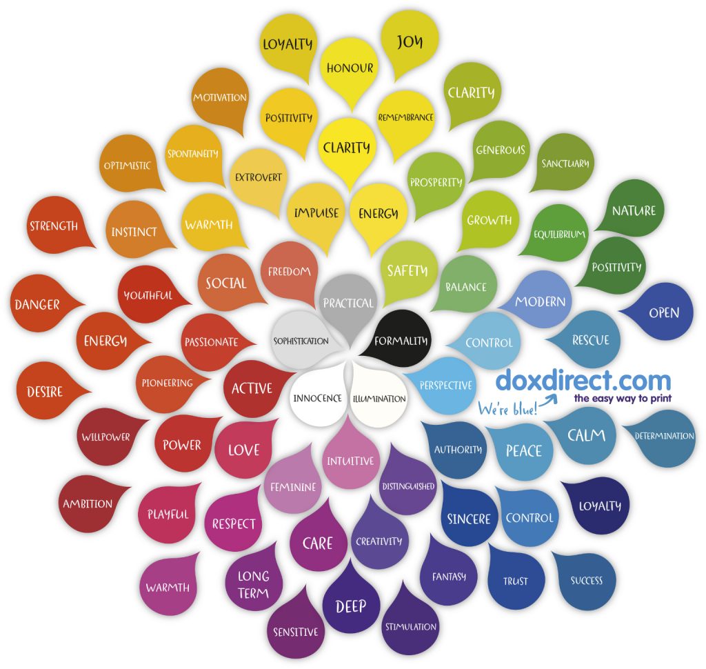
4. Colour
We explored the use of colour a while ago in our previous blog post ‘what colours shall I use‘ so we won’t go into the psychology of colour too much here, but there are some points it’s worth considering. Thrillers can often be found encased in a black book jacket. Exploring dark themes lends itself to dark images and colour. Light-hearted romances might often be found with light, pastel colours. Erotic fiction in reds and purples. And what about non-fiction? White and deep blues or greens to give a ‘no nonsense’, serious approach if it’s a manual or a teaching guide.
All these examples can be a guide to knowing what colours to use on your cover, but why not take a different approach? Try something to challenge the acceptable… Shocking pink with a dramatic heavy white typeface for a thriller would really make the book stand out on a shelf. Or bright yellow for a teaching guide to keep things fresh… the possibilities are only limited by your imagination.
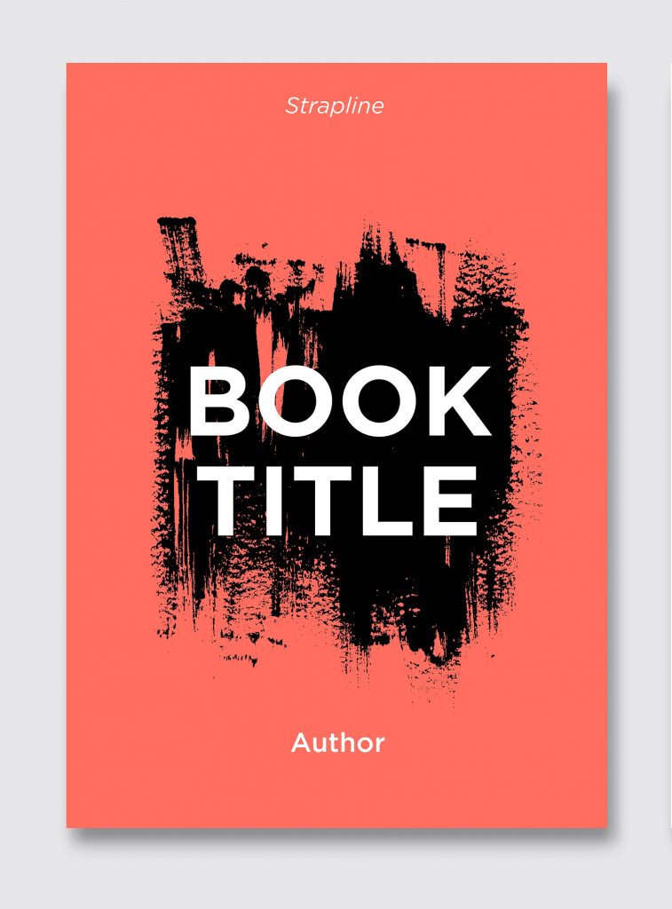
5. Images
When thinking about using an image on your book cover, one trick would be to take a concept or scene from the book, and build up an image around it.
There are some fantastic free image websites that give you access to thousands of royalty free images such as pixabay and unsplash, but if you don’t find quite the right image you were looking for on those, you can often pick up an image from iStock or Shutterstock for only £20 – £30.
6. Typography
The use of lettering on the cover is important to get right, again, it’s worth seeing how your genre of book has been handled by others. Is the type heavy? Whimsical? Light? If you’re using a strong typeface you can even use this as the whole design for the book, rather than it being image based, use of colour will help here too. It’s a good idea to use different fonts for the name of the book, the author and the strapline, if you’re using one, but don’t use any more than two or three fonts. Making use of a fonts’ bold/italic/light versions can also help to differentiate between titles.
Avoid fonts that are linked to films, bands, popular culture, or that have been laughed at (comic sans…!). You don’t want your cover to have underlying connotations. Also it’s a good idea to have the name of the author fairly small in comparison to the name of the book – save that for when you’re a world’s bestseller!
And finally, if in doubt, keep it simple. You can’t really go wrong if you use easy to read fonts with good contrasting colour – no red text on green background please!
7. Layout
It’s a good idea to think about what is the most important piece of information you need to convey. The book cover is essentially visual communication to engage and entice the viewer.
The order of the text, author, title, strapline… or title, strapline, author etc. won’t matter as much as the size of the font. If small, though at the top, your name won’t necessarily be read first. Try to keep all important text and images a few millimetres in from the edge of the page so there’s no chance of anything being chopped off.
8. How’s it looking?
Once you’ve got a cover that you like the look of, why not show a friend or family member for a second opinion. Someone else could also pick up any mistakes you may have missed… And you don’t want to end up featured in a future blog about ‘50 of the Worst Spelling Mistakes Ever‘. There’s some crackers here!
Happy designing!
The Doxtors